Logos
Our logo is the symbol. It is the only logo form the brand has, so use it everywhere the brand appears. Keep it at a size where its shape reads clearly. Do not rebuild it, stretch it or add elements to it. Use the symbol alone when the brand name is already clear nearby.
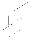
Symbol
Clearspace
Give the symbol room to breathe. Keep a clear area around every side, measured with the symbol itself as the unit. Never let type, images or other marks cross into that space.
Symbol
Logo colors
The symbol appears in a single color from the palette. Use Black on light backgrounds and White on dark ones. Never recolor the symbol outside the palette, and never place it on a background it cannot be read against.
Updated Oct 30, 2026